 Pin
Pin Photo by Erik Mclean
Car logos aren’t just pretty pictures slapped onto metal. They’re carefully crafted symbols that tell stories, evoke emotions, and create instant recognition in our minds. When you spot that prancing horse or three-pointed star, your brain processes decades of marketing, engineering excellence, and cultural meaning in mere milliseconds.
The psychology behind automotive branding runs deeper than most people realize. These emblems of car brands serve as tribal markers, status symbols, and emotional anchors that connect drivers to their vehicles on a personal level. A well-designed logo doesn’t just identify a manufacturer—it promises an experience, a lifestyle, and a piece of automotive heritage that becomes part of the owner’s identity.
Table of Contents
1. Mercedes-Benz
 Pin
Pin Image by zhenyegu from Pixabay
The Mercedes-Benz logo stands as one of the most recognizable symbols in automotive history, yet its origins trace back to a simple dream of universal mobility. Gottlieb Daimler sketched the three-pointed star on a postcard to his wife in 1872, envisioning engines that would power vehicles on land, sea, and air. This ambitious vision would eventually become the foundation of one of the world’s most prestigious automotive brands.
The star gained its distinctive circle in 1926 when Daimler-Motoren-Gesellschaft merged with Benz & Cie to form Mercedes-Benz. The circular laurel wreath that surrounds the star represented victory and achievement, borrowed from Benz’s original logo design. Today, this emblem represents not just luxury transportation, but German engineering excellence and innovation that has shaped the automotive industry for over a century. The logo’s clean, geometric design has remained virtually unchanged, proving that timeless simplicity often trumps trendy complexity.
2. BMW
 Pin
Pin Image by Mathias Westermann from Pixabay
For decades, automotive enthusiasts have repeated the story that BMW’s distinctive blue and white roundel represents spinning aircraft propellers, a tribute to the company’s aviation heritage during World War I. This romantic tale has been perpetuated by marketing campaigns and even BMW itself at various points in history. However, the truth behind this iconic logo reveals a much simpler and more practical origin story that connects directly to Bavarian regional pride.
The BMW logo actually represents the colors of the Free State of Bavaria, where the company was founded in Munich in 1916. The blue and white checkered pattern mirrors the Bavarian flag, creating a direct connection to the brand’s geographic roots. While BMW did manufacture aircraft engines during the early years, the propeller association came later as a convenient marketing narrative. The circular design simply followed automotive industry conventions of the era, when many manufacturers adopted round emblems to fit wheel centers and radiator caps. This revelation demonstrates how brand mythology can sometimes overshadow factual history in creating emotional connections with consumers.
3. Ferrari
 Pin
Pin Image by Jiří Rotrekl from Pixabay
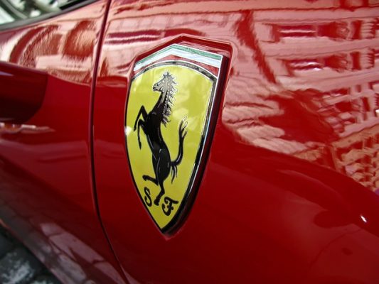
The Ferrari prancing horse carries one of the most poignant origin stories in automotive history, connecting the glamorous world of racing to the tragedy of World War I. Count Francesco Baracca, Italy’s top fighter ace, painted a black prancing horse on the fuselage of his aircraft as his personal emblem. When Baracca was shot down and killed in 1918, his grieving parents approached Enzo Ferrari years later with a request that would forever change automotive history.
Paolina and Enrico Baracca met Ferrari at a race in 1923 and suggested he adopt their son’s prancing horse symbol, believing it would bring good luck to his racing endeavors. Ferrari accepted the honor but made one significant modification: he changed the background from the original white of Baracca’s squadron to the distinctive Ferrari yellow, representing the color of Modena, his hometown. The black horse remained unchanged as a tribute to the fallen pilot, creating an eternal connection between aviation heroism and automotive excellence that continues to grace every Ferrari vehicle manufactured today.
4. Audi
 Pin
Pin Image by Tonypang from Pixabay
The four interlocking rings of Audi represent one of the most elegant mathematical solutions in automotive branding, born from corporate necessity rather than artistic inspiration.
In 1932, four struggling German automotive companies faced economic collapse during the Great Depression. Audi, DKW, Horch, and Wanderer merged to form Auto Union AG, creating a partnership that required a unified visual identity to represent their collective strength and shared commitment to engineering excellence.
The interlocking design symbolizes the unbreakable bond between these four manufacturers, with each ring maintaining its individual integrity while contributing to a stronger whole. This mathematical precision reflects German engineering philosophy, where every component serves both aesthetic and functional purposes. The logo survived corporate restructuring, ownership changes, and even the company’s resurrection after World War II, proving that well-conceived design transcends temporary business arrangements. Today, these four rings continue to represent unity, precision, and the enduring power of collaborative innovation in the global automotive marketplace.
5. Volkswagen
 Pin
Pin Image by Leonhard Niederwimmer from Pixabay
The Volkswagen logo embodies the democratic ideals of accessible transportation through its deliberately simple design philosophy. Created in 1937 during the company’s formation as part of the German Labour Front’s initiative to provide affordable automobiles for the working class, the logo combines the letters “V” and “W” in a clean, geometric arrangement that reflects industrial efficiency and mass production capabilities.
The circular border emphasizes unity and completeness, suggesting that automotive transportation should be available to all social classes rather than reserved for the wealthy elite.
The logo’s enduring appeal stems from its rejection of aristocratic automotive traditions in favor of practical, approachable design language. Unlike the heraldic symbols adopted by luxury manufacturers, Volkswagen’s emblem communicates reliability, affordability, and democratic accessibility. The post-war redesign maintained these core principles while refining the typography and proportions to create better visual balance. This commitment to simplicity over ornamental complexity has allowed the logo to remain virtually unchanged for decades, reinforcing the brand’s consistent message that quality automotive engineering should serve practical human needs rather than social status display.
6. Toyota
 Pin
Pin Image by Cicero7 from Pixabay
The Toyota logo represents a relatively modern approach to automotive branding, introduced in 1989 to replace the company’s original text-based identity with a more sophisticated visual system. The three interlocking ovals create a complex symbolic framework that communicates multiple layers of meaning simultaneously.
The two perpendicular inner ovals represent the mutual trust between Toyota and its customers, while also forming the letter “T” for Toyota. The outer oval encompasses both inner elements, symbolizing the global expansion of Toyota’s technological innovation and manufacturing excellence.
This carefully engineered design reflects Toyota’s systematic approach to both automotive manufacturing and brand development. The mathematical precision of the overlapping ovals mirrors the company’s commitment to continuous improvement and quality control processes that have established Toyota as a benchmark for reliability in the automotive industry. The logo’s clean geometry translates effectively across diverse international markets while maintaining cultural neutrality that supports the company’s global manufacturing strategy. The absence of cultural or regional references allows Toyota to present a unified brand identity that transcends geographic boundaries and appeals to practical consumers who prioritize dependability over prestige.
7. Porsche
 Pin
Pin Image by Dariusz Sankowski from Pixabay
The Porsche logo represents a masterful fusion of regional German heraldry with automotive performance heritage, creating one of the most recognizable emblems in motorsport history. The shield design incorporates elements from two distinct coats of arms: the black and red stripes with antlers derive from the Württemberg state coat of arms, while the central horse comes from Stuttgart’s city crest.
Stuttgart literally translates to “stud garden,” making the prancing horse a natural symbol for the city that would become synonymous with automotive engineering excellence.
Ferdinand Porsche established his company in Stuttgart in 1931, and the logo debuted on the steering wheel of the first Porsche 356 in 1952. The heraldic design communicates both geographic authenticity and aristocratic performance pedigree, positioning Porsche vehicles as worthy successors to European racing traditions. The shield format itself suggests protection and strength, qualities that resonate with drivers who demand both luxury and reliability in high-performance applications. This combination of regional pride and performance heritage has enabled the Porsche logo to transcend simple brand identification, becoming a symbol of engineering precision and racing achievement that commands respect across global automotive markets.
8. Chevrolet
 Pin
Pin Photo from Unsplash
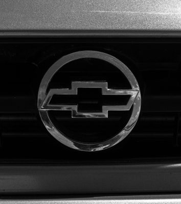
The Chevrolet bowtie emblem remains one of automotive history’s most contentious logo origin stories, with multiple competing theories that have sparked decades of scholarly debate among brand historians and automotive enthusiasts. The most widely accepted account credits company co-founder William Durant, who allegedly discovered the distinctive pattern on wallpaper in a Paris hotel room during 1908.
However, Durant’s own family members have disputed this narrative, with his daughter claiming he actually tore the design from a Virginia newspaper advertisement while the family was vacationing.
Additional theories suggest the bowtie design emerged from Durant’s admiration for the cross motif found on Swiss flag imagery, or that it represented a stylized interpretation of automotive engineering components such as a tie rod or suspension element. Some historians propose the pattern derived from textile industry influences, reflecting Durant’s background in carriage manufacturing where decorative fabric patterns held significant commercial importance. Despite extensive research efforts, no definitive documentation has surfaced to conclusively resolve the mystery. This uncertainty has actually enhanced the logo’s mystique, allowing Chevrolet to maintain an air of intrigue around its brand identity while the distinctive bowtie continues to represent American automotive accessibility and reliability across global markets.
9. Ford
 Pin
Pin Photo by Haberdoedas on Unsplash
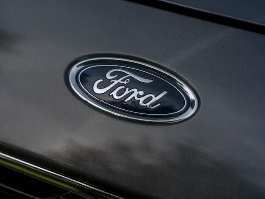
The Ford logo represents the pinnacle of personal branding in automotive history, transforming Henry Ford’s individual signature into a global symbol of industrial innovation and manufacturing excellence. The distinctive script lettering originated from Ford’s actual handwriting, specifically his signature as it appeared on the company’s incorporation documents in 1903.
This personal connection between founder and brand created an unprecedented level of authenticity in automotive marketing, establishing a direct relationship between Henry Ford’s vision and every vehicle that bore his name.
The elegant cursive design transcended typical corporate identity conventions by maintaining the organic qualities of human handwriting while achieving the consistency required for mass production applications. Ford Motor Company recognized the commercial value of this personal connection and standardized the script across all manufacturing applications by 1912. The logo’s enduring success demonstrates how authentic personal branding can establish lasting emotional connections with consumers across multiple generations. Unlike geometric or heraldic automotive emblems, Ford’s script communicates approachability and individual craftsmanship, reinforcing the company’s commitment to making automotive transportation accessible to ordinary American families through innovative manufacturing processes and competitive pricing strategies.
10. Lamborghini
 Pin
Pin Image by u_h49jk270jd from Pixabay
The Lamborghini bull emblem emerged from one of automotive history’s most legendary business rivalries, transforming personal frustration into a multi-billion-dollar luxury brand that directly challenged Ferrari’s dominance in the supercar market. Ferruccio Lamborghini, a successful tractor manufacturer, became incensed after Enzo Ferrari dismissed his complaints about clutch problems in his personal Ferrari 250 GT, reportedly telling him to stick to building farm equipment.
This perceived insult motivated Lamborghini to establish his own automotive company in 1963, adopting the bull symbol as both a reference to his zodiac sign (Taurus) and a representation of raw power challenging the prancing horse.
The raging bull logo communicates aggressive performance and uncompromising luxury through its bold, muscular design that contrasts sharply with Ferrari’s elegant equine imagery. Lamborghini’s choice of the bull reflected his determination to create vehicles that would surpass Ferrari in both engineering excellence and visual impact. The emblem’s gold coloring reinforces themes of exclusivity and premium craftsmanship, while the bull’s forward-charging posture suggests relentless innovation and competitive superiority. This strategic branding decision established Lamborghini as Ferrari’s primary rival and created a compelling narrative that continues to drive consumer interest in both brands through their ongoing competition for supercar market leadership.
FAQs
Animals represent power, speed, and prestige qualities that luxury automakers want to associate with their vehicles and brand heritage.
Ford’s script logo has maintained Henry Ford’s original handwritten signature design since 1903 with minimal modifications.
Most early automotive logos were created by company founders or engineers, with professional design firms becoming involved much later.
The circular blue and white pattern creates strong visual contrast and geometric simplicity that works across all applications.
Logo recognition triggers emotional associations with quality, status, and performance that significantly impact buyer preferences.


